Update: minor update to multiple choice selections
1752152601837
Audit & Supplier Compliance
Quality
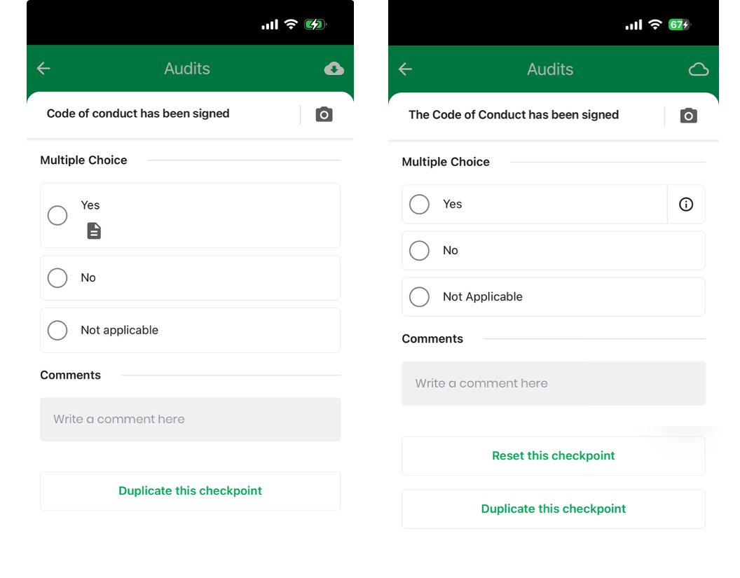
We have today released a simplified the design for multiple choice checkpoints. If there is an explanatory text for the checkpoint, it would previously show with a document icon underneath, leading to a very fragmented view.
Instead, the icon has been moved to the right hand side and replaced with a information icon instead.
Below you can see the old and the new version side by side.
Did you like this update?
![]()
![]()
![]()
{error_message}
Leave your name and email so that we can reply to you (both fields are optional):
Thanks for your feedback!
Published by Søren Riis Mønsted